This is Part 1 of a four-part series, What makes a good location-based emission factor?, which uses new analysis to answer open questions about the emission factor hierarchy proposed in the GHG Protocol’s revision of its Scope 2 Guidance.
- How much does location matter in location-based accounting? (this post)
- How local should location-based accounting be?
- How current do emission factors need to be?
- Putting the location-based hierarchy to the test
Nearly every company that reports its greenhouse gas emissions reports a location-based Scope 2 inventory: the emissions associated with the electricity it consumes, calculated using the average emission rate of the grid that serves it. The calculation itself is simple (multiply electricity use by an emission factor), which means that almost all of the weight rests on a single choice: which emission factor to use.
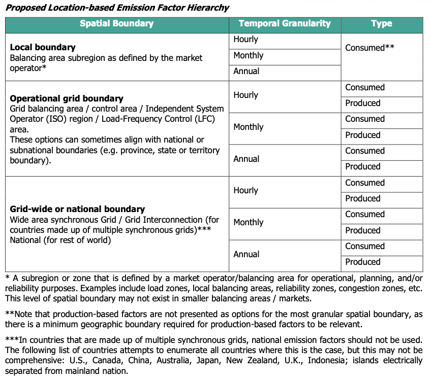
The GHG Protocol’s proposed revisions to the Scope 2 Guidance, released for public consultation in October 2025, introduces an emission factor hierarchy: reporters would be required to use the most precise emission factor accessible to them. Precision is defined along three dimensions: the factor’s spatial boundary, its temporal granularity, and its type (whether it reflects emissions consumed or produced within a region).
That each of these dimensions matters has a solid basis in prior research. But building a hierarchy requires knowing how much each one matters, and how they should rank against each other when a reporter can’t have the best of all three. This series uses a large set of simulated Scope 2 inventories to answer those questions, starting with the dimension that has received the least attention.
What prior research tells us, and what it doesn’t
Two of the three dimensions have been studied directly. On emission factor type, de Chalendar et al. (2019) showed that tracking electricity imports and exports between U.S. balancing areas substantially changes the emissions intensity attributed to consumption in many regions, because imported electricity can make up a large share of what a region actually consumes. On temporal granularity, my own 2022 study in Environmental Research Letters quantified how annual-average emission factors bias Scope 2 inventories relative to hourly factors. Most buildings fell within ±5%, but the bias reached 33% in some buildings and was considerably larger in regions with higher shares of variable renewable energy.
Spatial granularity is a different story. It has long been recognized that grid carbon intensity varies from place to place, and that recognition is part of why the proposal moves away from national averages. But to my knowledge, no study has quantified how much error spatially coarse emission factors actually introduce into a Scope 2 inventory. Nor has any study compared all three dimensions against each other to test how a hierarchy should rank them.
That makes spatial granularity the natural place to start. It is the least-studied of the three dimensions, and it is the one the proposed hierarchy places at the very top. If spatial granularity turned out not to matter much, the hierarchy would be built on the wrong foundation.
A quick primer: the three qualities of an emission factor
Before getting to the results, it is worth briefly defining each dimension, since they come up throughout the series.
Where (spatial boundary). An emission factor describes a specific geographic area. The proposed hierarchy defines three tiers. At the top is an operational grid subregion (labeled “local boundary” in the proposal), a subregion defined by a grid or market operator, such as a load zone. Next is the operational grid boundary, which in the U.S. generally means a balancing area (BA): the area within which a single grid operator balances electricity supply and demand in real time. There are roughly 60 active BAs in the U.S., ranging from a single city’s utility to multi-state markets. At the bottom is the grid-wide or national boundary, which in the U.S. means one of the three interconnections (Eastern, Western, and Texas), or a national boundary in countries with a single synchronous grid.
When (temporal granularity). An emission factor can be an hourly value, a monthly average, or an annual average. More granular factors capture the fact that the grid’s generation mix, and therefore its emissions intensity, changes from hour to hour and season to season.
What (type). A consumption-based (or “consumed”) factor reflects the electricity actually delivered to a region, accounting for energy imported and exported across the regional boundary, and energy charged and discharged across time by energy storage. A production-based (or “generated”) factor, on the other hand, only reflects the carbon intensity of the generation fleet that exists within a boundary. The difference matters most for regions that trade a lot of power with their neighbors: a region with clean local generation that imports a large share of its electricity from coal-heavy neighbors will look much cleaner on a production basis than it actually is on a consumption basis.
The proposed hierarchy ranks these dimensions in a specific order: spatial boundary first, then temporal granularity, then type. So for example, an hourly production-based factor would rank above a monthly consumption-based factor. The proposal also limits when older factors can be used, which effectively makes a factor’s vintage (the year it describes) a fourth quality. Part 3 takes that up.
Evaluating the hierarchy
To evaluate the hierarchy, I followed the same approach, and used the same sample of buildings, as my 2022 study. I calculated location-based Scope 2 inventories for more than 112,000 residential and commercial buildings across 51 balancing areas in the contiguous U.S., using each type of emission factor in the hierarchy, and compared the results.
The building load data comes from the End-Use Load Profiles dataset from the National Laboratory of the Rockies (formerly the National Renewable Energy Laboratory, or NREL), which provides hourly electricity consumption for buildings sampled to be representative of the building stock in each grid region and climate zone. For emission factors, I used hourly production-based and consumption-based factors for each balancing area from the U.S. Energy Information Administration’s Hourly Electric Grid Monitor for 2025, then aggregated them to coarser spatial boundaries (EIA regions, interconnections, and the contiguous U.S.) and coarser temporal granularities (monthly and annual averages). Each building’s inventory is simply its hourly load multiplied by the relevant emission factor, summed over the year.
To measure how much each emission factor choice matters, I treated the inventory calculated with the most precise factor available across the U.S. (balancing area, hourly, consumption-based) as the benchmark, and calculated how far every other inventory deviated from it. I then compared these deviations to the GHG Protocol’s rule of thumb for materiality: an error greater than 5% of an inventory is considered materially misleading. Throughout this series, “error” refers to how far an inventory deviates from the most precise benchmark inventory. The question being asked is how much a reporter’s inventory would change if it used a less precise factor instead.
The full methods, including how emission factors were aggregated, how results were weighted, and the limitations of the analysis, are described in a companion methods post that covers all four parts of this series.
Finding: spatial granularity is critical for inventory accuracy
To isolate the effect of the spatial boundary, I held the other two dimensions constant (using hourly, consumption-based factors throughout) and varied only the boundary.
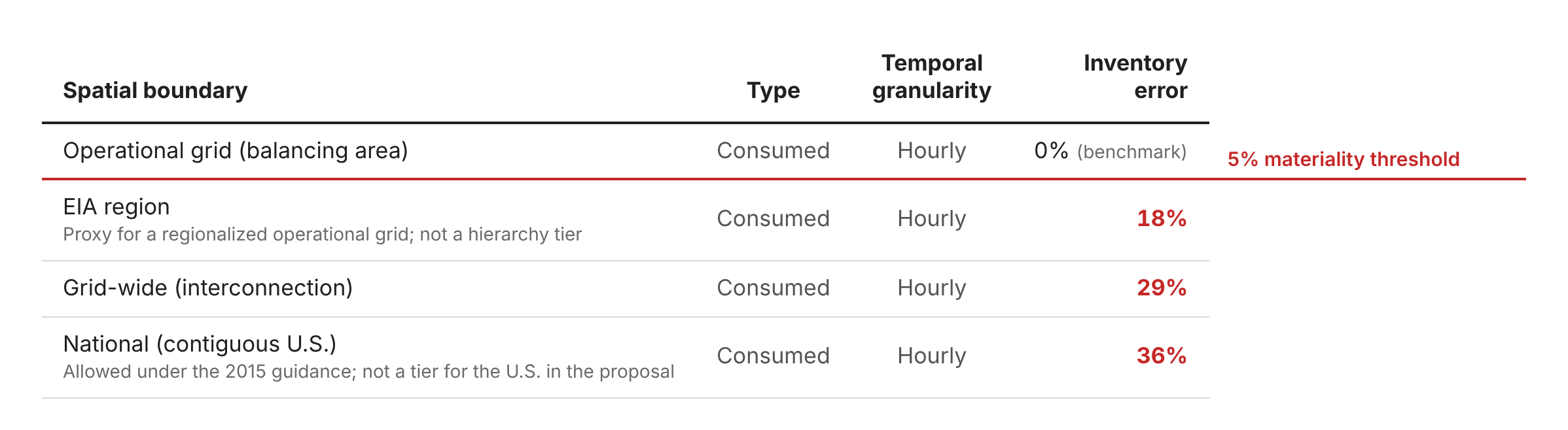
The results are not subtle. National average factors, which many U.S. reporters have used under the 2015 guidance, misstate the average building’s inventory by 36%. The grid-wide boundary, the coarsest boundary the proposal would allow in the U.S., only reduces that error to 29%. Even EIA regions, which are much smaller than interconnections, introduce 18% error. Every boundary coarser than the balancing area is well above the 5% materiality threshold, by a factor of three or more.
As Part 4 of this series will show, these errors are also far larger than those associated with the other two dimensions of the hierarchy.
Why the boundary matters so much
The reason is that grid generation mixes differ sharply within large regions. A single interconnection includes balancing areas dominated by hydropower and nuclear alongside balancing areas dominated by coal and natural gas. An interconnection-wide average assigns every reporter the same middle-of-the-road rate, overstating emissions for buildings in cleaner regions and understating them for buildings in more fossil-heavy ones.
Transmission constraints add to this. Electricity does not flow freely across an entire interconnection; most of what a building consumes is generated relatively nearby or imported from neighboring areas. A consumption-based balancing area factor captures those actual flows. A grid-wide average assumes they do not exist.
It is worth noting that these over- and underestimates might roughly cancel out if you added up every reporter’s inventory across the country. But that is little comfort to any individual reporter. An organization with an inventory that is 30% too high or too low is getting a misleading picture of its emissions, can’t be meaningfully compared to its peers in other regions, and has a distorted sense of which of its facilities to prioritize for reductions.
What this means for hierarchy design
The first implication is that the proposed hierarchy is right to put spatial granularity at the top. Of the three dimensions, it is the one where choosing a less precise factor introduces the largest error. Preferring grid-wide factors over national averages in countries with multiple synchronous grids is also an important improvement over the 2015 guidance, given that national factors misstate the average inventory by 36%.
The second implication is that the grid-wide tier should be treated as a last resort, not an acceptable alternative. An average error of nearly 30% is not a small loss of precision. In the U.S., free, hourly, consumption-based factors are already available for every balancing area, so this fallback should rarely, if ever, be needed here.
The third implication raises a new question. If even an EIA region, roughly the size of the largest U.S. grid operators, introduces 18% error, is the operational grid boundary itself always granular enough? Some U.S. balancing areas, like MISO, PJM, and SPP, span many states and now operate across areas that were once separate balancing areas. That is the question Part 2 of this series takes on.
Next: Part 2, How local should location-based accounting be?